Back to top

Wine Label Design for Linnuoweiqi Trademark

The magic is in the details. Aesthetics unites. It resonates with everyone since it touches every heartstring. In-thing, the differences in cultures and mentality don’t matter anymore.

A beautiful wine label absolutely provokes good reactions anywhere in the world, eye-catching and raising customers’ interest. The novelty intrigues while the perfection fascinates.

It brings the joy of visual pleasure and tactile cognition, opens up another dimension of a person’s life. A bottle of wine with a beautiful label itself becomes a value, pleasuring you with each sip of a wonderful drink.

Customer:

Agro-Yug LLC

About Customer:

This is a Ukrainian family-owned winery that provides a full technological cycle of production of wine: from grape growing to bottling the finished wine into the bottles.

Country:

Ukraine

Year:

2021

Category:

Labels, Self-adhesive labels, Wine labels

Task

To design labels for a wine line of their own manufacture destined for export to the Chinese market.

Customer Request

The production of Private Label wines is a strategic direction of our customer’s activity which means the production of quality wines under the clients’ trademarks. Every project requires an exclusive label and packaging design to personify the brand, reveal its benefits for the customers, and contribute to its successful promotion.

To design a unique label and packaging for the Cabernet-Sauvignon, Saperavi, Merlot line of wines that should be exported to China has come first for our team. These are good wines of the middle price segment. So, we have to design the labels in the appropriate way taking into account the tastes of Chinese consumers.

Idea

Having a successful experience in product design for export to China and being aware of the specifics of this market, we wanted to project a beautiful, unique label, the aesthetics of which would not be inferior to the well-known brands’ design.

We made a decision to design a series of labels for the wine line in one style with certain differences that concerned only the names of wines. We didn’t use conventional techniques but at the same time tried to take into account the current trends in world design that would resonate with the target audience.

Design Trends

Over the past few decades, there has been a substantial increase in Chinese consumer interest in imported wine that is becoming a part of modern culture. The European wine, even if it’s an expensive one, is preferred by Chinese consumers over the wine of local producers.

In doing so, they give preferences to well-known European brands or wines of the traditional wine-making regions, for example, French. But, if a foreign brand has gained confidence, then it will easily retain the loyalty of its fans.

Studies show that Chinese customers prefer and buy a classy and expensive, worthy of purchase wine. Such details as awards and regalia of the wine or brand that boost their credibility in consumers should advisably be depicted on the label.

Gold elements and calligraphic fonts are also appreciated. However, it should be mentioned that the hieroglyphs on the wine label do not add brand values. In contrast, a European-styled wine label having foreign language inscriptions on it is more attractive to Chinese buyers.

Wine is often purchased as a gift, so the bottle design takes the lead. The points above should be taken into account when designing or adapting labels and packaging for wine, destined for export to the Chinese market.
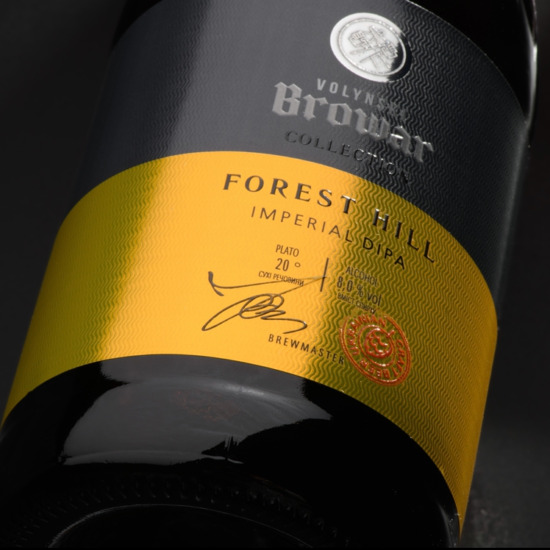
Result

Our team has designed a series of labels for branding wine destined for export to the Chinese market.

The labels are designed in a classic winemaking style. They look rather strict, presentable, and elegant pointing out that this is a product of premium quality.

The TCD Company is a world-class design studio. We’ll help to build your brand awareness and to present itself!


    More works